Accessibility is about making sure everybody, regardless of their abilities can access, understand, and navigate web content, regardless of how they’re accessing it. It is recommended that accessibility testing is conducted throughout the design and development process.
I’ve previously blogged a little about accessibility, but in this blog post I want to share a number of different ways in which you can start to automate testing for accessibility. It’s important to note that although we will be looking at various ways to automate catching accessibility errors, these do not guarantee that your site is accessible. The absence of errors DOES NOT mean your page is accessible or compliant. Always combine automated testing with ongoing manual testing. Manual testing is the most reliable method to assess accessibility.
Keyboard access
Are you able to reach everything that’s interactive using the tab key? Can you also interact with the elements using space-bar, enter key, are things focusable, labeled appropriately etc. It’s important because a user may be unable to use a mouse; instead, they may use just the keyboard to navigate the web.
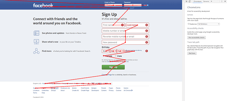
When thinking about testing the tab flow you could simply load up your web application and tab through each field, but what if we could start to quickly visualise this, or maybe we may still want to tab through manually but save the visual flow to attach to a story we are testing?
I’ve previously written a few ways you could do this using ChromeLens and/or using JavaScript in the browser which you can find here - Automating page tabability.
Tools
WCAG 2.0 references
Page structure
Are you are using semantic elements and roles? It’s important because a user of your site may be low-sighted and so may need to navigate around the page by jumping to the page section they want to get to.
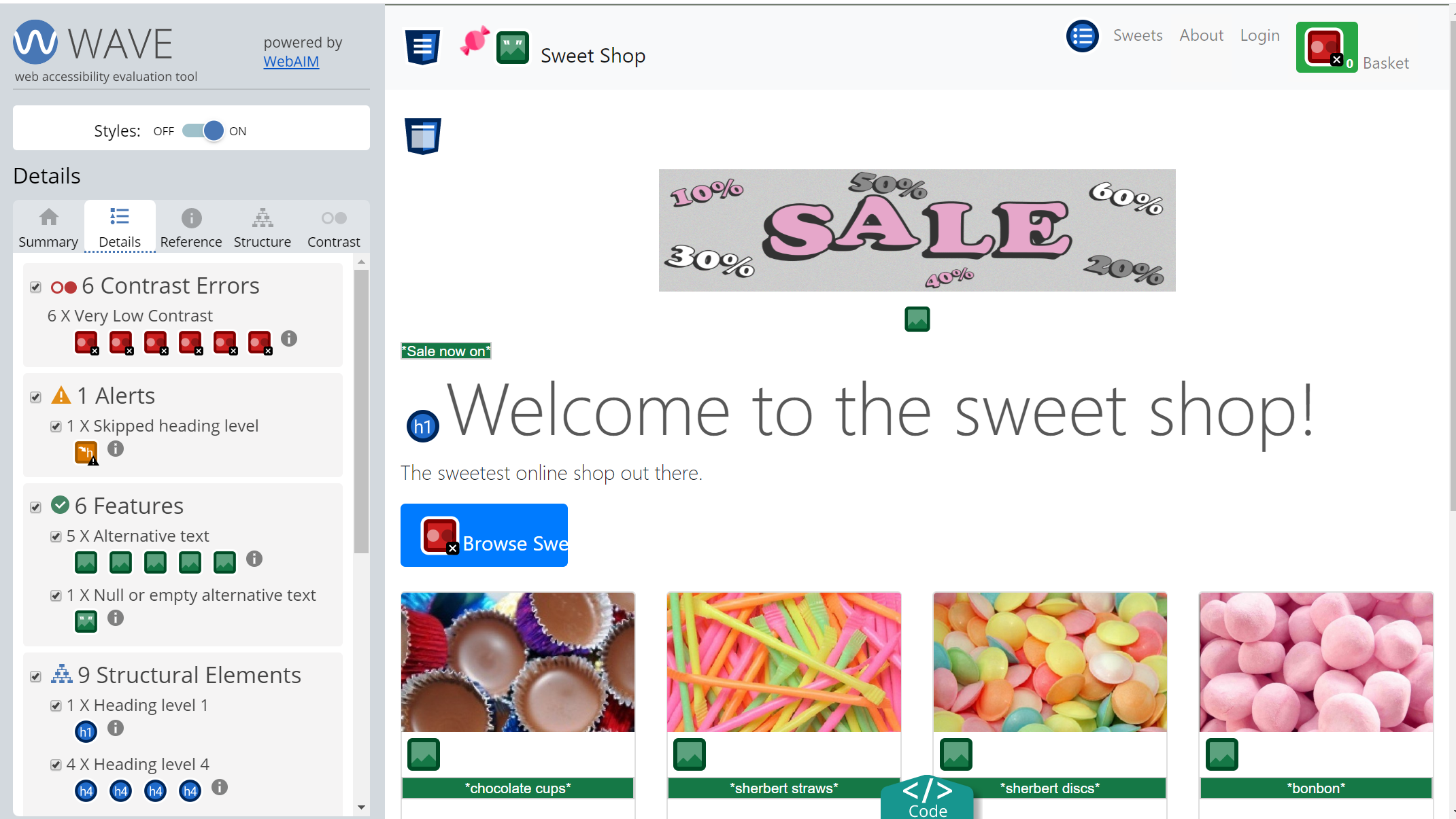
The WAVE browser extension is available for both Chrome and Firefox. After installing the tool simply navigate to the page you want to check and then press the WAVE icon within your toolbar. “You will notice a new sidebar popup and WAVE will present your page with embedded icons and indicators. Each icon, box, and piece of information added by WAVE presents some information about the accessibility of your page.”
Within the sidebar you can view details of the structual elements of your page, view the structure of the page as well as switch off styles in order to see whether the page is structured in a logical way.
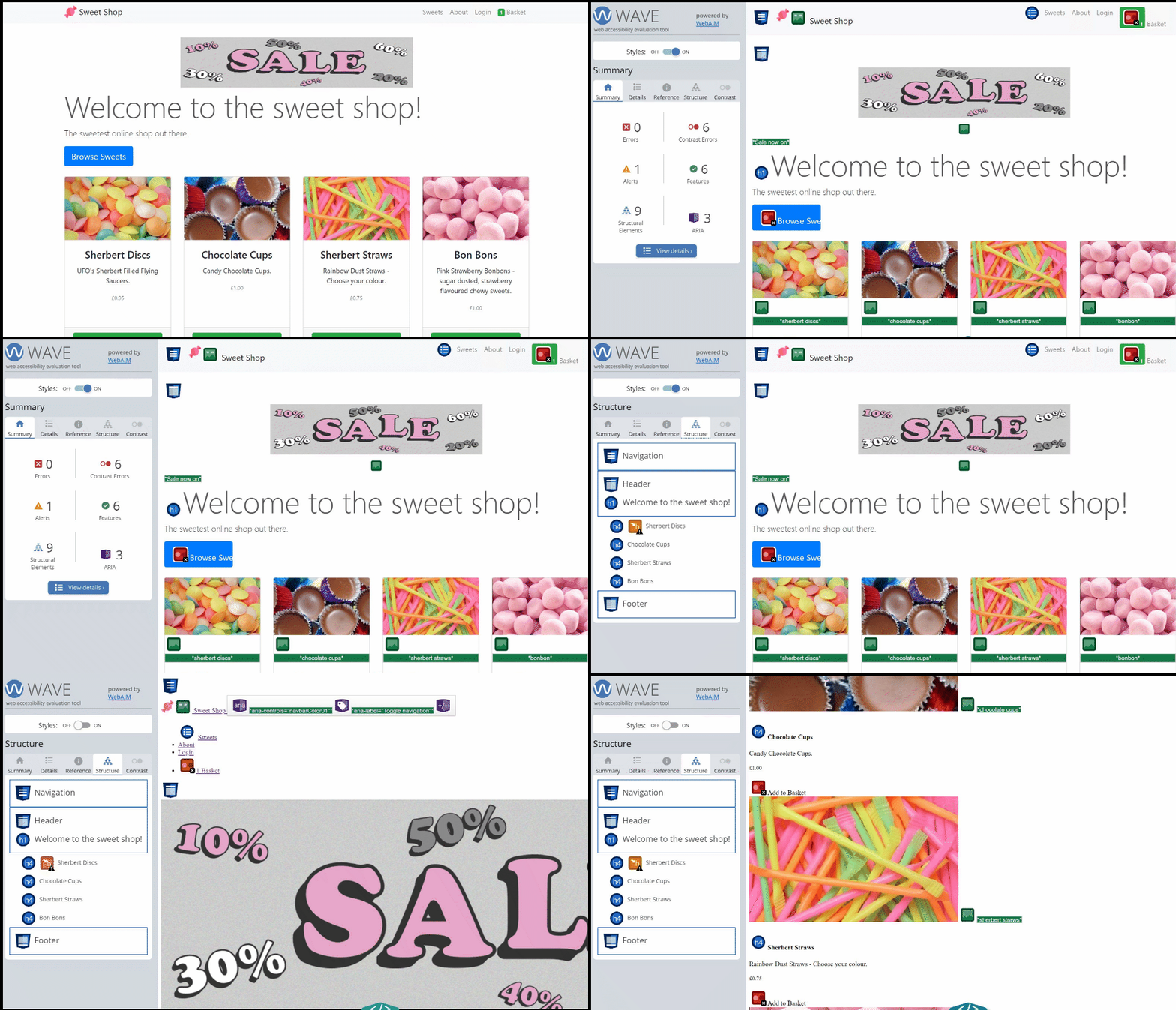
It’s also possible to check if your page is structured in a logical way by disabling all stylesheets using a little bit of JavaScript. Click here to view my previous post on this method.
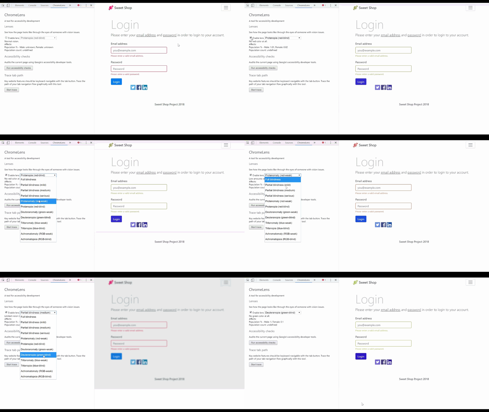
As well as offering a nice way to visualise the tab flow through your application (mentioned above), ChromeLens also offers ‘Lenses’, visual impairment simulation. This tool lets you see how the page looks through the eyes of someone with vision issues.
Using the ‘Lenses’ simulator you can test for a whole range of different vision issues. An example where I’ve found ‘Lenses’ handy is where a system relied on colour in order to inform a user that there had been a problem. The application showed red text and a red border around an input to show there had been an error rather than displaying a meaningful error message to the user.
Tools
WCAG 2.0 references
Images
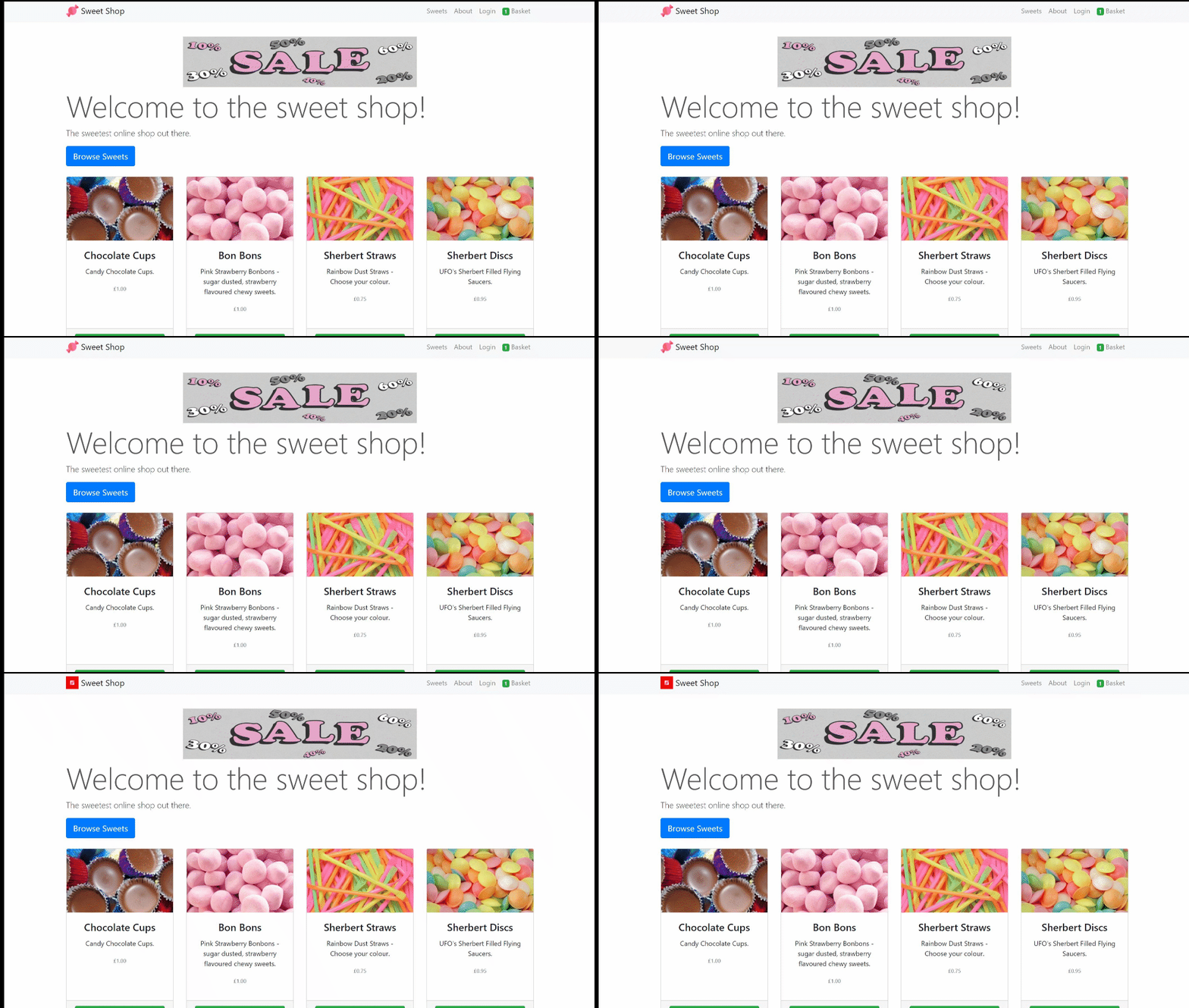
Are you providing text alternatives for people who cannot see images? It’s important because a user of your site may be blind and so uses a screen reader to read the alt text in order to understand the contents of an image.
One of the easiest ways to check for alt tags is to use the WAVE browser extension which was mentioned earlier. Once you have installed the extension, click on the WAVE icon and within the sidebar popup you will see any image alt tag issues reported in the summary withing the errors section.
Another way to check for any images which do not contain alt tags is to use the Useful Snippet Chrome Extension. This extension once installed provides various useful snippets within the extension. Once you have run a snippet it’s code is also copied to the DevTools console enabling you to copy the JavaScript snippet code to execute elsewhere or to create a bookmarklet so you do not need to keep using the Chrome extension if you do not wish to.
Tools
WCAG 2.0 references
Colour and contrast
Are you using enough contrast between text and its background colour? It’s important because a user of your site may have low vision and so needs content to have enough contrast to read it.
A simple way to check for colour contrast issues is to use the WAVE browser extension. Once you have installed the extension, click on the WAVE icon and within the sidebar popup you will see details of any contrast issues. There is also a contrast tab where you can provide colours in order to test the contrast ratio of a given text and background colour.
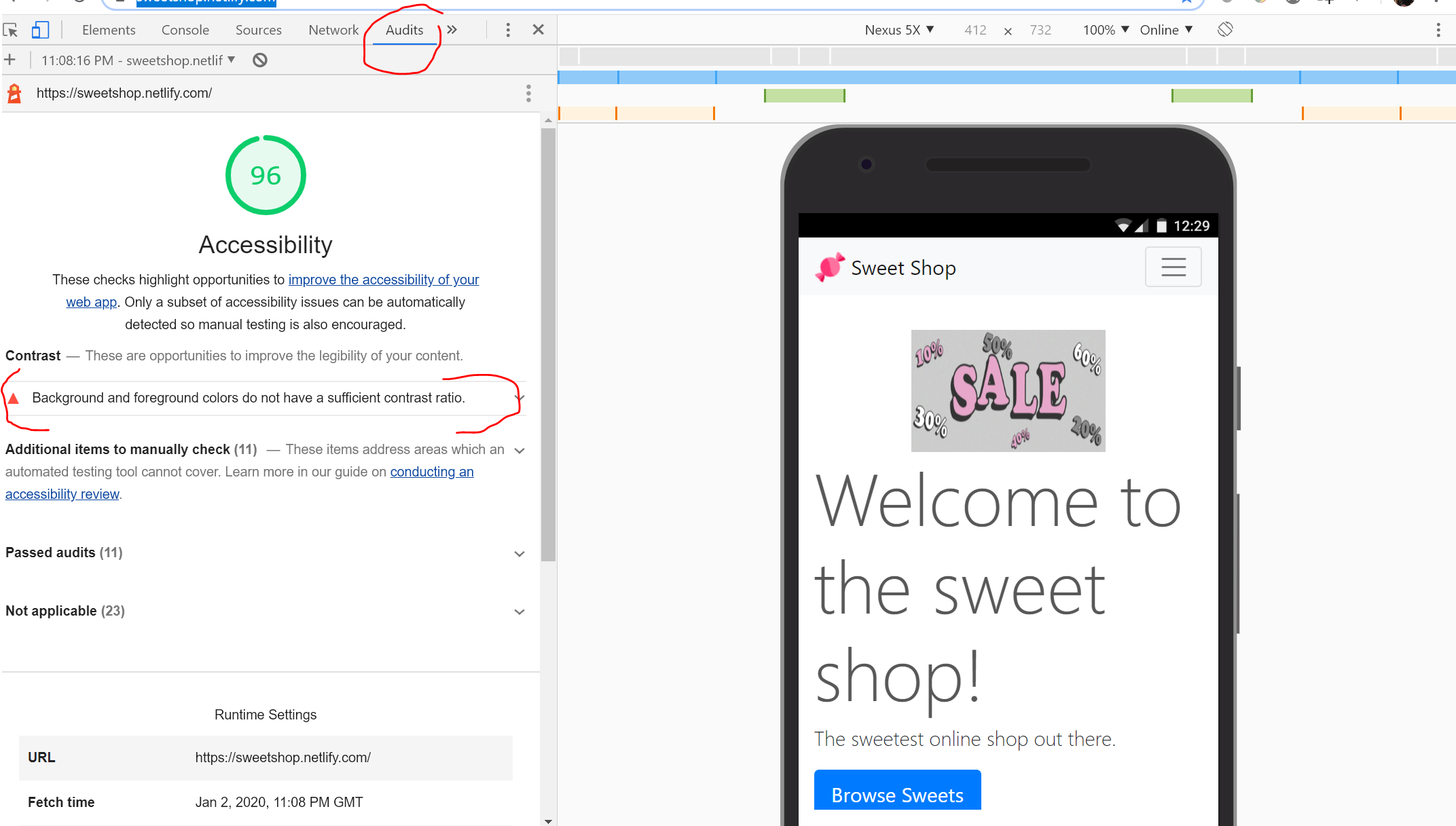
Within Chrome if you didn’t know there are some DevTools built in to the browser. If your ‘lucky’ enough to be on a windows machine you should be able to press CTRL+SHIFT+J OR F12 or Command+Option+J on a Mac and the DevTool window will popup. On the far right of the DevTools popup window you will see an Audits link. Simply click on this link, pick which options you want included in your report and then click on ‘Run audits’. Here you can generate an accessibility report which includes checking colour and contrast.
As I mentioned earlier, don’t use colour alone to convey meaning. Use icons, text, and other visual elements to reinforce the meaning of the content.
Tools
WCAG 2.0 references
Thank you for reading
Hopefully this post was useful. If you have any tips around accessibility I’d love to hear from you.

